August 16th 2011
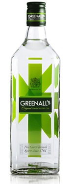
G&J Greenall’s London Dry Gin is celebrating its 250th anniversary with a new look and repositioning strategy courtesy of brand and design consultancy, Dragon Rouge. With the repositioning, the company hopes to attract a new generation of gin drinkers. A bold and clean logo replaces the old script one and rests prominently on a contemporary dark green square label. "The Great British Spirit since 1761" at the bottom of the front panel reassures customers of its tradition. A proprietary green abstract "Union Jack" on the inside back label acknowledges the brand’s heritage, but provides an edgy new look and feel.
According to David Jenkins, Dragon Rouge, "The objective was to create a new visual identity and package design to increase shelf impact, build awareness and appeal to a new generation of gin drinkers. We started by defining the brand essence as, ‘The Great British Spirit,’ which directly references the brand’s origins and traditions and then focused on creating a new visual identity that combines tradition and heritage, but with a modern twist.”

Article can be found at Food and Beverage : Marketing Insights into Packaging Solutions.

No comments:
Post a Comment