In hope of improving the cat, I redrew some faces as I think it would work better if it looked a little more feline. I also experimented with some line work and watercolour texture as I think the design overall just looks too flat.
I think overall the cat looks a lot better.
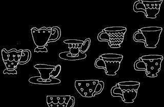
I also experimented with drawing some tea cups to represent the 'breakfast' element of the title.
I arranged them into a pattern so it can be used as background.
I also drew the type for the authors name. I chose a contrasting style so as not to overcomplicate the design.
I think that overall the cover is starting to work a lot better. I think that the skyline works a lot better with a less strong/dark colour, and the added texture of the watercolour brings a new dimension to the design. I think that both the skyline and the tea cup pattern work really well, but I am still not 100% happy with the cat. I think that it needs to fit in better with the rest of the design.


No comments:
Post a Comment