I have been using this image of a plain white paper bag to experiment with the different elements of the identity and bring my designs on paper to life...
Saturday 28 January 2012
Kit Cat's party bag research
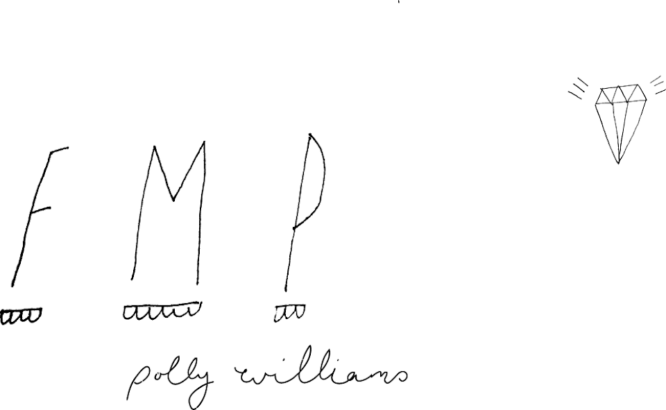
Today I have been researching ideas for the second part of the Kit Cat's brief. I am designing a range of business and party stationary as well as a luxury party bag for the event. I have been researching into the kings of favours/gifts that guests usually receive after an upmarket event.
These party bags show the kind of thing I am thinking of :

Miniature Champagne bottles make good favours for the kind of event I am working with. There is room for maintaining the identity across the packaging design of these bottles - the label or even tissue wrap.
The bag that the favours come in needs to reflect the aesthetic of the event - both the identity of the event, and the luxury of the event - this is the souvenir that they will take to remember the event and could promote future business if it does it's job correctly.

These party bags show the kind of thing I am thinking of :

Coloured sweets could be given as a favours - the colour could tie in with the colours of the identity that have been established; blue white and gold.
Miniature Champagne bottles make good favours for the kind of event I am working with. There is room for maintaining the identity across the packaging design of these bottles - the label or even tissue wrap.
The bag that the favours come in needs to reflect the aesthetic of the event - both the identity of the event, and the luxury of the event - this is the souvenir that they will take to remember the event and could promote future business if it does it's job correctly.
I have also e-mailed my friend who works for an upmarket events company to see what kind of things are usually in a gift/goody bag.

Friday 27 January 2012
Research into 1950's dining
Research into 1950's dining sourced from http://www.foodtimeline.org/fooddecades.html
I want to get an idea of the kind of food and drink that was popular in the 1950's as this could form the content for the menu and hopefully give me some ideas for the party bag that I am also designing.
POPULAR FOODS INTRODUCED IN THE 1950s
[1950]
Sugar Pops (Kelloggs)
Minute Rice (General Foods
Lawry's Seasoned Salt (Lawry's)
Legal Seafoods (Boston-based restaurant chain)
Diners Club (credit card)
Dunkin' Doughnuts (fast food chain)
[1951]
Ore-Ida Foods (frozen potato products)
Duncan Hines Cake Mix (Nebraska Consolidated Mills)
Tropicana Products (Florida orange juice)
Jack-in-the-Box (fast food chain restaurant)
Taco Bell (fast food mexican restaurant)
[1952]
No-Cal Ginger Ale (Kirsch Beverages)
Sugar Frosted Flakes (Kellogg's)
Pream non-dairy creamer (M & R. Dietetic Laboratories)
Dehydrated onion soup mix (Lipton)
Ms. Paul's Fish Sticks
[1953]
Lawry's Original Spaghetti Sauce Mix (Lawry's)
Sugar Smacks (Kellogg's)
Cheeze Whiz (Kraft)
TV Dinners (Swanson)
Pepperidge Farm butter cookies
White Rose Tedi-Tea (Seemaon Brothers)
"Irish Coffee" (San Francisco's Buena Vista Cafe)
Denny's (restaurant chain)
Star-Kist brand (canned tuna)
Eggo Frozen Waffles
[1954]
Trix (General Mills)
Butterball Turkeys (Swift-Eckrich CO.)
Stouffer's frozen meals (Stouffer)
Nonfat dry milk (Carnation Co.)
Burger King (fast food chain)
Shakey's Pizza (fast food chain)
Peanut M&Ms (Hershey's)
Marshmallow Peeps (Just Born)
[1955]
Special K breakfast food (Kellogg's)
Pepperidge Farm cookies (Bordeauz, Lido, Milano, Orleans)
McDonalds (Kroc style)
Kentucky Fried Chicken (Colonel Sanders)
[1956]
Imperial margarine (Lever Brothers)
TreeSweet Products (fruit juices)
Certs (breath mints)
Chocolate covered ants
[1957]
Gino's (fast food chain)
Pam (nonstick cooking spray)
Refrigerated cookie dough (Pillsbury)
[1958]
Tang [orange-flavored breakfast drink]
Ruffles [potato chips]
Rice-A-Roni [packaged flavored rice product]
Williams-Sonoma [upscale cookware retailer]
Sweet 'n Low [sugarless sweetener]
Cocoa Puffs [breakfast cereal, General Mills] Jif [brand peanut butter]
Chicken Ramen [instant noodle product, Nissen Foods]
Instant Tea [Lipton]
Pizza Hut [franchise restaurants]
International House of Pancakes (IHOP) [family restaurants]
[1959]
Royal Crown Cola
Frosty O's (General Mills)
Ocean Spray brand products (name changed from National Cranberry Assn)
Haagen-Dazs Ice Cream
--SOURCES: The Food Chronology, James Trager [Owl Books:New York] 1995 & The Century in Food: America's Fads and Favorites, Beverly Bundy [Collectors Press:Portland OR] 2002 & Candy: The Sweet History, Beth Kimmerle [Collectors Press:Portland OR] 2003
1950s Cocktails
"Standard American alcoholic beverages & cocktails, circa 1950s beer, bourbon highball, brandy highball, champagne punch, eggnog, Cuban cola (rum & coke), French "75" (gin, sugar & champagne), mint julep, randy smash, planter's punch, rum Collins, Tom Collins, Scotch and soda, rye highball, the screwdriver."
SOURCE: The New Wolf in Chef's Clothing: The picture cook and drink book for men, Robert H.Loeb, Jr. [Follett Publishing:Chicago] 1950 (p. 115-124)
"Cocktails, long cold drinks such as highballs, and beer are the favorites among the alcoholic beverages of this country. There are a few epicures who know and appreciate wines and who can distinguish among vintages. Most of us are content with serving sherry, vermouth, or Dubonnet before diner, and on special occasions offering an appropriate wine with a meal to which it adds enjoyment. Sometimes a brandy or a cordial will also be served after coffee. There are a few simple rules which should be followed in the service of beverages of this sort. The next few pages will be devoted to the question of what to serve, when, and how. For more detailed informaiton, I refer you to Along the Wine Trail, by G. Selmer Fougner, published by the Stratford Press, Boston, which contains accurate and practical information...There are actually hundreds of recipes for cocktails. You may go as far as you will in experimenting with them yourself, but be careful about offering a strange mixture to guests, unless you heave the makings of other drinks on hand that are hand and are hospitable enough to allow them to choose something else. The two most popular before-dinner cocktails are Martinis and Manhattans. Next perhaps come old-fashioneds, whiskey sours, and daiquiris. If you make these according to the accecpted practice, it will not be necessary to have any more on your list of standbys. Service of Cocktails: All cocktails except old-fashioneds are mixed with ice in a cocktail shaker, but some of them are stirred instead of shaken. If you have only one shaker, Martinis and Manhattans may be stirred and served in pitches form which they may be poured into the cocktail glasses in the living room. Old-fashioneds may be mixed at the bar, if you have one, or in the kitchen, which is easier, and where you generally have better results. They are brought to the living room on a tray. To serve the usual type of cocktail, arrange the glasses of standard size, which may have long or short stems, with the shaker on the tray. Small napkins should accompany them, and coasters may be offered with them if you are particular about rings on your mahogany. A tray of canapes, savory crackers, or an assortment of relishes should be offered with cocktails."Silver Jubilee Super Market Cook Book, Edith Barber [Super Market Publishing:New York]. Revised edition. 1955 (p. 84-5)
[NOTE: this book contains instructions for Daiquiris, Manhattans, Martinis, Old Fashioneds and Mint Juleps. It also contains note on serving beer, selection and car of wines, and service of liqueurs. Does not mention brand names. We can send these pages if you like...just need fax number or mailing address.]
These cocktails and alcoholic beverages are listed Irma Rombauer's Joy of Cooking, circa 1953:
Alexander, Artillery Punch, Beer & Ale, Benedictine, Bowl or Fruit Cup, Brittany, Bronx, Champagne, Claret Cup, Clover Club, Corree, Cuba Libre, Cubana, Curacao, Daiquiri (& frozen daiquiri), Eggnog, El Presidente, Frisco, Gin Bitter, Gin Sour, Gordon, Highball or Ricky, Knickerbocker, Larchmont, Manhattan (dry & medium), Martini (& dry martini), Miami, Milk Punch, Millionaire, Mint Julep, Old-Fashioned, Orange Blossom, Pradise, Pink Lady, Planter's Punch, Rum Collins, Hot Buttered Rum, Hot Rum Lemonade, Tum Punch, Sazerac, Sidecar, Stinger, Tom and Jerry, Tom Collins, Whiskey Cup, Whiskey Sour, Whiskey Toddy, White Lady, and Mulled Wine. (P. 966-7) [NOTE: We can supply pages.]
Thursday 26 January 2012
The Good Times
This newspaper 'The Good Times' was published rather aptly on the 16th of January this year - allegedly the most depressing day of the year - by The Church of London. I love the aesthetic of the publication which is illustration heavy with a custom typeface which is used throughout. I think that this application of custom lettering is a good way of contextualizing it which I could use in my own project.


Toormix
Toormix is a design studio based in Barcelona specialising in branding and art direction. Since its creation in 2000 works on corporate identity, editorial, print, web and communication projects.
I am planning a trip to Seville and Barcelona over the Easter break to visit friends, so I might see if I can go for a studio visit while I'm there.
This project is for Betlem, an old deli grocery store at the Barcelona's Eixample district converted now into a gastro-bar. This project involves brand design, graphics, façade and corporate materials for Betlem,

I like the way-finding graphics that they have created for different elements of the restaurant. They represent the different things successflly while still remaining in-keeping with the brand identity.

I think that this is a succesfull example of identity accross a range of products.

I like the use of the way finding icons as a pattern for the reverse side of the stock. This injects the brand colour but not in an overpowering way. This is a good way of applying image/illustration to a indentity project without distracting from the main information that needs to be displayed and the functionality of the products.


I think that the way that they have photographed all of the different elements slightly raised off the surface helps to make it appear less flat.

Photographing the brand in with plated up food helps to put it into context.

These two images form a gif. on their studio website which animates the stationary by combining three pictures with the paper rolled back to different degrees.


Some other identity work by Toormix.


Posters & Flyers
Images of the final posters and flyers for the Future Shorts film night at the Brudenell Social today.


Online promotion for the night :


Monday 23 January 2012
Illustration brief
Wildlife Artist Of The Year Competition 2012
Deadline: February 29, 2012 (37 days left)

Now in its fourth year, our wildlife art competition attracts many hundreds of entries in a spectacular array of different styles and media, from the UK and around the world – last year, we received artworks from as far away as India, China, Brazil and Australia. So choosing the winners is a pleasurable challenge for our panel of expert judges.
Last year a superb pastel study of a pair of Amur tigers bewitched the judges with its powerful composition and strong sense of movement and light. Amur Ambush won Stella Mays the prestigious title of BBC Wildlife Artist of the Year 2011 and an unforgettable trip to Sabah, Borneo, in search of orangutans.
This years categories:
• British Mammals (behaviour and portraits)
• British Birds (behaviour and portraits)
• All Other Wildlife (behaviour and portraits, in the UK and worldwide)
• The Wonder of Plants (British and worldwide)
• Beneath the Water (marine and fresh water)
• Animals in their Environment (British and worldwide)
• World Mammals (behaviour and portraits)
• World Birds (behaviour and portraits)
• Black and White Nature (pencil, lino cuts, etchings, wood block etc)
• Visions of Nature (innovative, creative impressions of wildlife)
• Frozen Planet (please note: entries must feature animal life)
• Endangered Species (entries must feature species listed by the IUCN as ‘Endangered’ or ‘Critically Endangered’)
• International Artists – a category judged digitally, exclusively for artists outside of the UK. This is to save our international entrants the great costs of sending artwork to the UK. International artists can enter up to eight images in this category only.
No artwork may be entered in more than one category, aside from international artists. The artwork must not have won a prize in any other competition anywhere in the world, or been published by a third party. Artwork must feature wildlife – birds, mammals, waterlife, invertebrates and plants – in a natural or captive environment. Computer-generated artworks will not be accepted.
Eligibility
The competition is open to all artists worldwide aged 18 or over, amateur or professional.
Prize
The BBC Wildlife Artist of the Year 2012 will win a place on a 10-day painting safari in Botswana (worth £3,450). This incredible trip will run in October 2012. The prize includes flights from the UK and accommodation is in comfortable camps – a truly unforgettable experience.
All of the category-winning pieces will be showcased at the prestigious annual exhibition of the Marwell International Wildlife Art Society in August 2012, in a special display alongside the work of 200 other artists and sculptors. The awards ceremony will take place on the opening night of the exhibition.
The overall winning artwork will also be displayed at The Natural Eye, the 48th annual exhibition of the Society of Wildlife Artists at the Mall Galleries, London, in autumn 2012.
All of the category-winning pieces will be published in the August 2012 issue of BBC Wildlife (on sale 4 July). The winning, runner-up and commended artworks will also be published in an online gallery.
Illustrato typeface.
Jorrit Van Rijt is a designer from Utrecht in the Netherlands. I love this custom typeface that he created whilst experimenting with different shapes. Each letter is completely unique. I also like the way that he has applied it to different layouts and designs.


An idea every day
Bram Vanhaeren is a freelance designer from Belgium. These are a selected few of his poster designs for an on going project entitled 'An idea every day' which features famous graphic design quotes as well as motivational and advisory statements on the subject, presented in a visually engaging way. I think that this is an interesting way to present a message and I like his use of combined image and type.


This poster actually reminds me of a poster that I designed last term. I think that this style works well - with the text appearing cut out of the image.


Point G Plaisirs Gourmands
Chez Valois Branding & Design is a Montreal-based agency that designs for premium brands but with a commercial edge. I love this particular piece of packaging and brand identity. Again, it is packaging which is not necessarily an area of graphic design that I want to focus on, however the application of image to a context is what I am interested in. I am interested in the idea of creating an identity for a product under a brand, and then applying it to packaging, point of sale, bags and artwork.
Concept for the brief :
'Point G a French word, meaning the G spot… but make no mistake, don't get any ideas, we are talking here about a gourmet spot, the rallying spot of all foodies! Because gastronomy mixes both pleasure and sensuality, it can be shared, offered, discussed… in flavours, colours, images and words. Ode to gastronomical delights in all their forms. With the new packaging platform, you lick (léchez), drink (buvez), crunch (croquez), experiment (expérimentez)… gulp (gobez), spread (tartinez), roll (tirez), pearl (perlez), sear (saisissez), share (partagez), and so on…
Chez Valois was mandated in 2011 to review the overall identity of the Point G brand. The challenge of the mandate was both to express and evoke the pleasure of gastronomy while depicting the enthusiasm, passion and humour of the colourful chief proprietors of Point G, Thierry and Julien. It was therefore necessary to fuse all the elements together and play with subtlety, in keeping with the manner of these two chefs. We had to be sexy without using sex. Our challenge was to create an intimacy, an interaction with the consumer, in a way that makes the initiated smile and charms even the most timid. The words appearing in fuchsia on the packaging are those associated with gastronomy and good food. Both catchy and intriguing, they surprise and titillate the imagination. The mouth-watering images depict the freshness and finesse of the product. The structural design of the boxes, in turn, provides the packaging platform with its distinctive character, enhances the sensory experience for the consumer, and allows for fun and engaging store displays.
The founders of Point G wanted to create an identity that they could relate to. Even though they are considered the masters of macarons and other gourmet delights in Montreal, they did not want to play up that reputation. In this respect, the cliché of elitist luxury that some pastry brands project was a million miles away from who Point G truly is. Because they had, some years before, come up with the irreverent idea of naming their Company Point G for Point Gourmet (or whatever else naughty minds might imagine), we wanted to assume that identity and express it fully. The result of the packaging platform is powerful, while speaking with finesse and humour. The big words are now part of the vocabulary of the brand, and express themselves without vulgarity, surfing the subtlety and sensuality of a culinary and sensory vocabulary.'


Subscribe to:
Posts (Atom)