Toormix is a design studio based in Barcelona specialising in branding and art direction. Since its creation in 2000 works on corporate identity, editorial, print, web and communication projects.
I am planning a trip to Seville and Barcelona over the Easter break to visit friends, so I might see if I can go for a studio visit while I'm there.
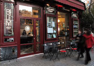
This project is for Betlem, an old deli grocery store at the Barcelona's Eixample district converted now into a gastro-bar. This project involves brand design, graphics, façade and corporate materials for Betlem,
I like the way-finding graphics that they have created for different elements of the restaurant. They represent the different things successflly while still remaining in-keeping with the brand identity.
I think that this is a succesfull example of identity accross a range of products.
I like the use of the way finding icons as a pattern for the reverse side of the stock. This injects the brand colour but not in an overpowering way. This is a good way of applying image/illustration to a indentity project without distracting from the main information that needs to be displayed and the functionality of the products.
I think that the way that they have photographed all of the different elements slightly raised off the surface helps to make it appear less flat.
Photographing the brand in with plated up food helps to put it into context.
These two images form a gif. on their studio website which animates the stationary by combining three pictures with the paper rolled back to different degrees.
Some other identity work by Toormix.


No comments:
Post a Comment