Monday 30 April 2012

App and packaging development

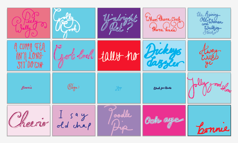
I have been working on ideas for the visual identity for the stamp booklet and post card packaging. I decided to use one of the phrases as an identity for these as I felt that it needed some kind of type based information. My concern is that these won't link directly to the colour bar used in the print and postcard designs, however this could be incorporated into the packaging designs as well if I felt that this was a problem further on down the line. 

I have also started to work on the iphone app. The concept for the app is that it is a regional phrase translator but with a typographic theme. The user searches for the expression that they are looking for and the phrase (if contained in the dictionary) is revealed in a stylised typographic from along with it's translation. There is also the option to view the shop, where the user will be offered a selection of prints/postcards etc to purchase. At this stage I am not sure if the design I have come up with functions very well. I'm not sure that the search function is quite the right way to access the phrases. At this stage I would say that it is a proposal so the database of phrases contained within the dictionary would only consist of the 66 words and phrases I have created so far. However, should this app be fully produced, it would seem like gathering an infinite number of phrases could be impossible. Perhaps it would function better if you could flip through the phrases almost randomly - like a random generator. Seeing as a lot of people using the app may not necessarily know what they are looking for, but may want to browse and learn some new expressions. There is the potential to have both a search and a scroll function on the app. I will explore this further tomorrow.

Initial ideas for home screen :


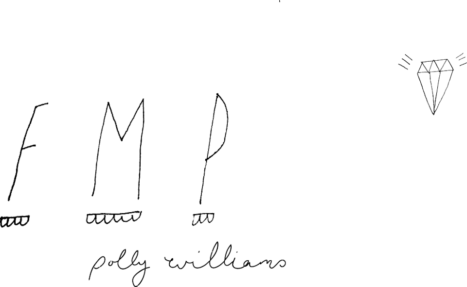
Initial idea for app icon :


Post card designs


Fronts


Reverse

Print layout experiments

I have been working on the set of prints for my british isles type brief. I have decided to work with a less conventional format of 420mm x 500mm to break the A format routine. I picked a few of the phrases and then played with colour and layout until I had over 50 variations to choose from. I decided to use the colour palette as a visual aid at the top of the poster to kind of link the designs together a bit like the way that a logo would. Another branding element that links them is the choice of type at the base of the design explaining the translation of the phrase. This could be varied in colour according to the text and background colour. I think that the full map of the british isles could work better on a larger format more towards A1 or A0 scale just due to the detail of the design and the importance that the shape that the words form being translated correctly.

Saturday 28 April 2012

Stamp development


Colour palette development

I wanted to create a more restricted colour palette for the post card designs as I feel so far my colour choices, even where they have worked successfully, have not been very considered. I want the overal colour theme to represent that of the british flag. On the main british isles print, there is such a vast volume of words that it can hold a lot of colours such as pinks and purples, without loosing the overall strength of the reds and blue's. However, with the postcards, there is only colour choice for the words and one for the background so the colour choices need to be more considered.
As a starting point I found an interesting image of a british flag to work with and create a basic palette. I chose this image because it contains some purples as well.
I found another image that I think contains colours that I think could work...


...and developed this palette. The square size is relative to the ratio of that colour that can be used within the overal set of cards in order to maintain the right volume of the main red and blue colours.
I like this visual tool and think I could include it on the accompanying prints.


Colour theory

In order to develop my colour picking skills I have started to follow a range of blogs that specialise in colour documentation and palette making. I find Creature Comforts one of the best as it enables you to search the archive by a specific colour. I think it is important to try to gain inspiration from objects and surroundings rather then simply design/art which sometimes I find hard considering these are my surroundings a lot of the time! I find blogs like this help me to broaden my view of colour and design.


Stamp research


Post cards - development

I am working on a range of post cards as part of my British Isles type exploration brief. I am designing between 20 and 30 and then will refine 10 to print that could be sold either individually or as a set.