
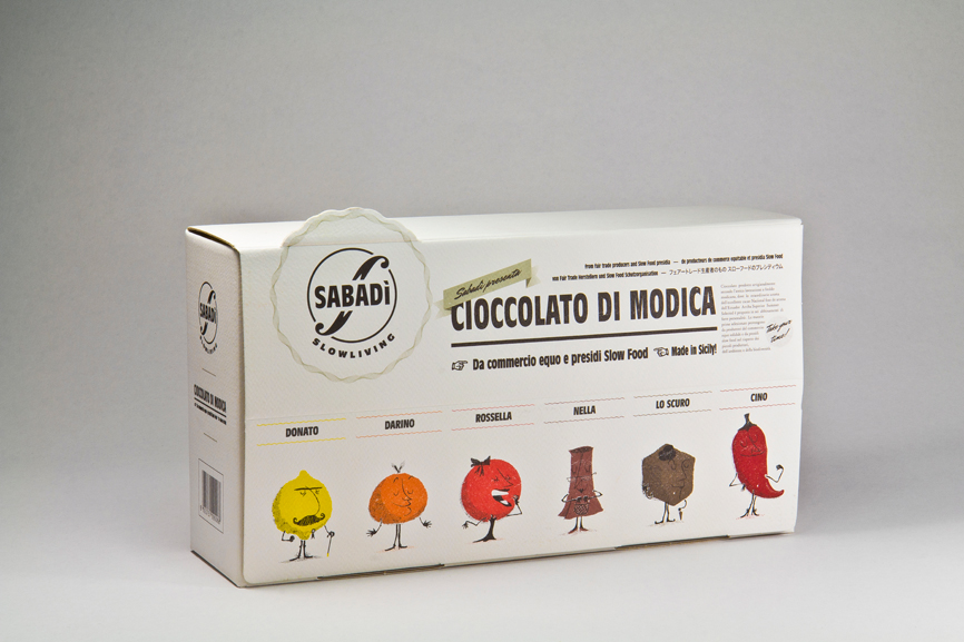
This chocolate range “cioccolato di Modica" is the first product from the brand Sabadì. It is designed by Verona based studio Happycentro. The brand name is similar sounding to the italian word for saturday and as they describe it “… perhaps the day that does not exist… the day when we slow down, we reflect on what is really important…”. This idea was to reflect the owner of the brand's own mood about business and life in general. The cocoa is sourced from Ecuador and there are six flavour combinations. They chose to reflect this with 6 characters with strong personalities.
In my own work this term I am focussing on applied illustration. I am trying to come up with ways that I can exploit this as well as showing competence as a graphic designer rather than an illustrator. This project involves some character illustration which I think works really well as a tool to brand the various flavours.


I am not interested in packaging that is driven by form and involves complex nets, but I am interested in using packaging as a medium to apply my designs to.
Something like this brief would work well for me, where the nets are not incredibility complicated and the large flat plains allow for the design to be the main visual focus.


I love the attention to detail with these designs, and the consideration that has been taken as to how the product will interact with the point of sale packaging.


No comments:
Post a Comment