Tuesday, 29 May 2012

FINAL EVALUATION

After feeling dissapointed with my work from the last module, I think I have significantly improved elements of my practice throughout my FMP. I feel like both the projects that I selected for myself as well as some of the live briefs I have completed have provided me with some work for my portfolio that I am content with and that I feel really represents who I am as a designer and where I want to go from here.
I also feel that I have explored range and distribution more fully than I have in previous modules. I have not limited myself to what I think is achievable, but instead let my ideas drive the work, figuring out how best to execute or propose them later on. This in tern has forced me to explore areas of research, such as specific print processes, that I had not previously explored in this amount of detail. I think that overall this has resulted in some much more interesting work than I have previously created.

On reflecting on my statement of intent from the start of the module, I have actually met the majority of intentions that I outlined in my rationale, such as a more thorough investigation of print processes, print visits, engaging in live briefs, securing placements, developing stronger concepts within my very visually based work, continuing with illustration in order to strengthen my skills, designing for surface application rather than packaging itself, exploring identity but not branding, exploring colour and pattern and designing for a range of budgets. Another intention I outlined was to contact a range of studio's that I am interested in, in order to develop a better understanding of how image driven design, custom typography and applied illustration fit in a commercial environment. I think that I have explored this through both my ppd and my research for my design context publication. One intention from my statement of intent was that my work would mainly be intended for print, but has the potential to be applied to screen based media. I think that throughout this module my interest in design for digital application has grown and this is now an area that I would very much like to develop in. I would say that the themes and audiences that I outlined in my statement of intend remain very much the same, along with the design diciplines that I outlined. However, I would add design for digital application to my secondary concerns, including design for motion graphics as well as design for icons as I feel that these are two areas that I have only just scratched the surface of, but would like to continue to develop my skills in this area after I leave.

In terms of skills which I outlined as wanting to further throughout my FMP, I think that I have developed most of them. In particular developing my knowledge of industrial production, developing my research skills, drawing more regularly in order to improve, improving my skills involved with working with clients such as communication, pricing and negotiating deadlines, and developing my software skills including learning how to use Fontographer which I had previously not used. Time management has been something that I have constantly been trying to work on ever since first year. I think that the issue is not to do with my dedication of time to the course, but more to do with how I spend the time that I have. I think that the last module really highlighted this and I feel that there has been a genuine improvement in this area. My action plans and timetables have been far more detailed and updated more regularly, outlining specific tasks rather than general projects. I made sure that I was spending a more equal amount of time on each brief rather than getting carried away with one or two and neglecting the others. I reflected on how the brief would work as a whole rather than focusing on specific, sometimes irrelevant deliverables. I think that this massively improved the quality of the ranges within my briefs. As a result I think that my skills at fully resolving a brief have improved. Last module I altered my briefs a lot in order to resolve them which is not a very realistic way of working. This module I have stuck to my main briefs, the only alteration being that I have expanded them further than I had initially outlined in my statement of intent.
One skill I wanted to improve was screen printing, which I have only used in one brief. In hindsight I wish I had tried out some more adventurous printing and made use of this facility, however I intend to do some recreational printing after hand in. Other skills that I have developed in this module include writing my own copy, and visualising large scale ideas such as interior and exterior settings, installations and displays.

After a tutorial half way through the module I identified that I wanted to develop an ability to produce a range of differing type styles, to strengthen my portfolio and to provide more opportunities for freelance work in the future as trends and demands change. Once this was brought to my attention I actively set out to ensure that I explored as many styles as possible through my briefs which I feel I did successfully. On coming third at the Sh awards I was commended on my broad range of type styes which made me feel that I have definitely improved this ability, however I need to ensure that I continue developing fresh styles when I leave, even if it has to be through self- initiated work.


Strengths I have identified from this module :
  • The most successful briefs and most interesting visual solutions are the ones that started with a strong concept and were initially fulled by in depth research.
  • I have explored a range of differing type styles.
  • I have considered application of type to a range of different mediums.
  • I covered a range of subjects/themes/audiences in my briefs.
  • All research activites outlined in statement of intent were met.
  • I have made contact a broad range of professionals.
  • Completed two placements which have significantly informed my practice and helped me with my briefs.
  • Had successful experience working on live briefs.
  • As a result of this, I have built a network of clients and contacts.
  • I have started to visualise and embrace larger scale ideas.
  • I have managed to use illustration as a relevant and useful part of my practice as well as for live briefs.
  • I have developed confidence in proposing work for digital application.
  • I have developed a systematic approach to developing type work which I can continue to use when I leave and potentially work on freelance briefs where I will be required to answer the brief independently.
  • My blogs have been constantly up to date and my work process thoroughly documented.
  • I have employed more thorough and relevant research strategies.
  • My dedication to the course is consistent to the previous module, but I have improved my time management skills which I feel has impacted my work significantly.
  • I have improved my ability to work through a brief effectively and consider a more adventurous and more considered range.

Weaknesses/Areas of improvement I have identified from this module :
  • Photography skills have not improved from the last module.
  • Photo-editing skills have not improved significantly.
  • While I think that my software skills have improved this module, particularly in Photoshop and inDesign, I think that I need to bring myself up to speed with Illustrator.
  • I don't feel that I have made use of the screen printing facilities as much as I could have.
  • I don't feel that I made use of the web design sessions as much as I could have done as I feel like it is a really useful skill to have especially in terms of obtaining freelance work.
  • My crafting skills have not improved very much and my mock ups are not of as high quality as I had intended.
  • I think that achieving a first for my last two modules of second year might have made me loose sight of the areas I need to work hard at and perhaps not recognising my weaknesses. I think that under-achieving in the last module has given me the drive to evaluate my weaknesses and overcome them as much as possible this module. This informs me that I need to not become over-confident and need to continue to evaluate my practice critically and objectively when I go into the industry.
  • While I think I have improved my time management and ability to be more focussed, I think it is within my nature to be a bit scatty so I need to continue to enforce organisation on myself when I leave the course, especially if I am to go freelance in the future.

I feel that the FMP has really helped me to establish where I see myself fitting within the industry. It has also enabled me to develop a range of skills that will be integral to my practice when I leave. A combination of placements, my own development lead by the course structure and a genuine interest in the subject have given me the confident to produce work that I would never have imagined at the start of this course. My position statement was 'Applied custom lettering and illustration with a focus on surface application and promotion'. Interestingly I feel that this really has not really changed, and is more relevant now than it was when I wrote it. My final position statement as I leave the course is;
        'Applied custom lettering and illustration with a focus on surface application and identity.'


KIT CATS BOARDS


Applied illustration for identity and event.

This brief started as a live brief that I decided that I wanted to expand. It gave me the opportunity to explore applied illustration across a range of different elements. It also fuled an investigation into print processes including metalic inks and foiling and made me consider post-print issues such as making sure that the correct stock is used to avoid rub-off, and to ensure that inks are prepared so that they are heat-friendly to avoid metallic pigments from melting. This research came off the back of coming up with an idea that I didn't necessarily know how to create, so had to form my own path of investigation. I think that this was the main thing I got out of this brief.

GIN JOINT BOARDS


Applied custom lettering and typeface design for print and surface application.
This brief started as an idea that I got very excited about, then became slightly apprehensive. The main drive behind this brief was my love for gin and a genuine interest in it's history. Once I had got started with the brief, I started to worry that I wasn't  sure how I was going create the vision I had in my head. The brief built momentum again when I really started to consider the overall atmosphere of of the bar, rather than just the smaller details such as bar accessories and menu's. I think that the addition of the interior and exterior illustrations really brought the project to life. Had I used photographs I think that the mock ups would have looked lazy and not very considered. The style I used for the illustrations successfully reflects the full experience of the bar, rather than simply being a contextual reference. Another element I was particularly pleased with was the addition of an animated e-vite. I really enjoyed the motion graphic module in second year, and I especially enjoy storyboarding an idea. I think that this was a good edition to the brief as it introduced a digital element. One thing I think was less successful was the range of type I created. One issue that was raised earlier on in the brief was that there were two many styles of type. I evaluated this issue and decided that I felt that while there were three differing styles, they were never intended to really be used side by side so therefore it wouldn't be an issue. However on reflection, I think that the secondary typeface could be toned down somewhat to allow the primary typeface to sing out more. 

PENGUIN BOOK COVERS


Applied custom lettering and illustration for publishing and digital application.

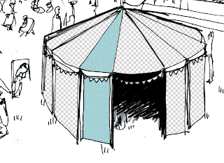
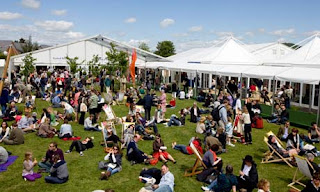
I wanted to use this brief as an opportunity to explore a range of different typographic styles but under the umbrella of publishing, as well as create some work that combines illustrated lettering with image making. The strongest element of this brief is the range of different type styles that I successfully explored. I really wanted to think outside the box in terms of range and distribution, and rather than creating a photoshop mock-up of a Waterstones facade and a matching tote bag, I decided to consider some more adventurous ideas, exploring digital and physical elements. I think that the apps were really successful and they enabled me to explore image making for digital application which is good in terms of broadening my portfolio. I think that putting the book editions in the context of the Hay Festival allowed me to explore some more adventurous proposals for the range. The chrome themes idea was potentially an unnecessary addition to the range, and I don't think that it fits in with the other deliverables.

BRITISH DIALECTS BRIEF BOARDS


Exploration of different lettering styles through application to print.

This brief as it allowed me to explore a vast range of different typographic styles, as well as explore copy writing which is something that I really enjoy doing. It was intended as a playful brief and I really enjoyed it. While I think that the range could have been developed a little more, I think that the main map piece in itself showcases a broad range of styles which is really valuable for my portfolio. 
This brief was mainly artworked in illustrator, as I required the type to be scaled up for print in order to showcase it best. This was good practice as sometimes my designs will be required to be enlarged to a huge scale and I need to know what design process I would take should this be required.

VALENTINES RANGE BOARDS

(See submission disk or click here to see these boards)

Applied custom lettering, image and identity across a range of printed media.

This brief started as brief form Tigerprint which I really wanted to continue. I liked how the brief was challenging me to create designs that are more versatile for both a male and female audience. I also liked having the opportunity to write my own editorial. I think that the designs were successful and I think it was really valuable and also interesting to research all of the various processes and appropriate stocks involved in producing a range such as this. It think in terms of deliverables, I tried to be adventurous in terms of Marks and Spencer, but I think I could have explored some more proposals.

SHORT LIVE BRIEFS BOARDS

(See submission disk or click here for boards)


8 live briefs featuring illustration, promotion and typeface design.

As I opted out of working on the year books, I felt that I needed to make sure that I worked on as many live briefs as possible. My long term goal is to become successful as a freelance illustrator, so I tried to complete a range of illustration briefs, but I also worked on some design briefs and a type design brief.  Some were paid, some were not. I think that the range of different kinds of brief was really good for me in terms of experience. I had mainly positive experiences working on these briefs, particularly the illustration ones. I found that both the Palladio invite brief and the Hush house flyers and posters brief involved a lot more alterations from the client than I had anticipated, and although I am not necessarily pleased with the end result, the client was satisfied. 
I really enjoyed creating the film credits typeface as it gave me the opportunity to create a functioning font on fontographer and learn this skill to an extent which is something I have been wanting to do.
I was skeptical about taking on the Bruisyard brief so late in the term and so close to hand in, but it gave me good experience in negotiating my own deadlines with the client in order that it suit me and fit in with hand in. I requested that I be briefed straight away so that I could start work immediately and get the illustrations signed off at least a week before hand in, and this all worked out fine.

To do Tuesday 29th May


TO DO

PPD
business cards
stationary
references
portfolio pdf
update website
blog linkd in profile/twitter/tweets
design strategy presentation - blog
blog & disk
last post summery and plan (200 words) 

STUDIO...
-Tape up Valentines work with invisible tape
-labels on EVERYTHING (ougd303/oupd301)
- One sleve per brief

BOARDS...
Correct live brief boards - check numerics are consistent for days and bhall brief alter. + more?
Correct vday boards for submission disk - remove last page
Correct gin joint first board for submission disk and change on blog.
Kit Cat's
Photograph kit cats place setting in context (?)
Finish boards
British Isles brief  
p.o.s? 
Typeface?
Finish boards

PROJECT FILE....
briefs - find old ones on blog and print?
offline content - emails, other sheets etc.
Module Evaluation -  RE-READ / re-print and condense / edit post

DP/DC Disk
dp/dc file
 Folder on disk with name and code on.
-pdf of dc on disk
- boards

BLOG...
-Change b6 tag on blog to 'short live briefs'
-Tag project file elements on blog....
-Design development boards - before evaluation and boards on blog (first post of each brief)
-update bi brief/kit cats final boards posts.
-Check over blog

book print for portfolio & calculate cost

e-mail rhianne about meeting

Design new business cards

Monday, 28 May 2012

Packaging for design context publication

I wanted the packaging, which is a belly band, to be lo-fi to fit with the style of the posters. I wrote it in my own hand writing to make it even more personal.


Hay Festival proposed instalations


Hay Festival

The book editions I have designed are for distribution at the Hay Festival so I have been researching some images from the festival to inspire me for my context mock ups and to help me come up with some proposals.


To do list Monday 28th May


TO DO
Kit Cat's
Photograph kit cats place setting in context (?)
Finish boards

British Isles brief  
p.o.s? 
Typeface?
Finish boards

PPD
business cards
stationary
references
portfolio pdf
update website
blog linkd in profile/twitter/tweets
design strategy presentation
blog & disk
last post summery and plan (200 words) 


STUDIO...
Tape up Valentines work with invisible tape

BLOG...
Change b6 tag on blog to 'short live briefs'

BOARDS...
Correct live brief boards - check numerics are consistent for days and bhall brief alter. + more?
Correct vday boards for submission disk - remove last page
Correct gin joint first board for submission disk and change on blog.

PROJECT FILE....
briefs - find old ones on blog and print?
offline content - emails, other sheets etc.
Module Evaluation -  RE-READ / re-print and condense / edit post


-disk x 3 (ppd, blogging & dp/dc) - Folder on disk with name and code on.
-pdf of dc on disk
-labels on EVERYTHING (ougd303/oupd301)
- One sleve per brief

Tag project file elements on blog....

Design development boards - before evaluation and boards on blog (first post of each brief)

update bi brief/kit cats final boards posts.

Check over blog

book print for portfolio & calculate cost

e-mail rhianne about meeting

Design new business cards

Design practice posts

Design practice posts for some of my short live briefs can be found on the additional disk submitted with my project file, or at the following links :

http://www.scribd.com/doc/95268016/Bruisyard-Hall-Brief?secret_password=1s7e1oouzxtg7s3hp6b9

http://www.scribd.com/doc/95268034/Graduate-Entrepreneurship-Project-Brief?secret_password=1jfgrq9vdj6nmalqomat

http://www.scribd.com/doc/95268044/M-S-CARDS-BRIEF?secret_password=jrc3dmia65tpckwuvh1

http://www.scribd.com/doc/95268048/Palladio-Brief?secret_password=sk24brvvgp7ln8ul098

http://www.scribd.com/doc/95268060/The-Modern-Original-Brief?secret_password=1pschfxc09ud7wkeaua4

Design practice posts

PDF blogging for design practice part of this brief can be viewed here or on the additional blogging submission disk supplied within my project file.

Sunday, 27 May 2012

Research into types/weights of stock for book publishing

Text pages of the book: 75 GSM Maplitho/Natural
For color book/art book etc.: 90 GSM to 130 GSM Matt Art Paper & Fine Art Paper
For Paperback cover: Minimum 250 GSM to 300 GSM Art Card
For Hardback jacket cover: Minimum 170 GSM Art Paper

Saturday, 26 May 2012

Marks & Spencers online shop research


Type development for design context publicaiton

Each poster is designed to have a quote from the text on the reverse side in a hand drawn illustrated style which reflects my practice....
I have tried to reflect the quote in the style of the lettering.


Book editions - context

I have been researching how I can put the covers into more of a context. I think that it might me more interesting if they were intended for a book fair, exhibition or independent retailer rather than simply for a mainstream book store.
I have been looking at the possibility of V&A exhibition and supporting products for the gift shop....


DC poster proofs

I printed my design context designs so that I could check for errors more easily and check that the scale/point size/layout etc is working. I am glad I did as there were quite a few alterations!